Client
L&E Research
Agency
Enthusiast
Role
UI / UX, Visual Design, Icon Illustration, HTML Email Design & Development
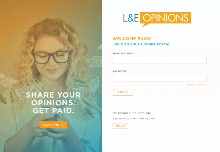
L&E Research provides companies with the facilities and people necessary to conduct market research. The driving technology behind L&E’s business is the L&E Member Portal. L&E uses the Member Portal to recruit users to participate in market research studies for their clients. Members fill out questionnaires, which are screened by L&E to determine if the members qualify for a study. Unfortunately, as we found out through user testing, L&E’s members found the process of signing up for a study and the interface of the portal confusing.
Process
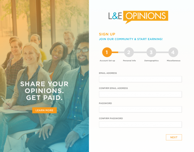
For this project, I collaborated with a team of UX researchers and developers. After reviewing the existing portal, I documented areas that needed improvement and created a low-fidelity wireframe sketch. Then, I translated the drawing into a high-fidelity prototype using Sketch and Invision.
Our team conducted two rounds of testing. The test groups consisted of people who were active members of L&E’s Member Portal and who were unfamiliar with L&E Research. After each round of testing, the prototype was updated to incorporate user feedback.

Research Findings


Confusing Navigation & Terminology
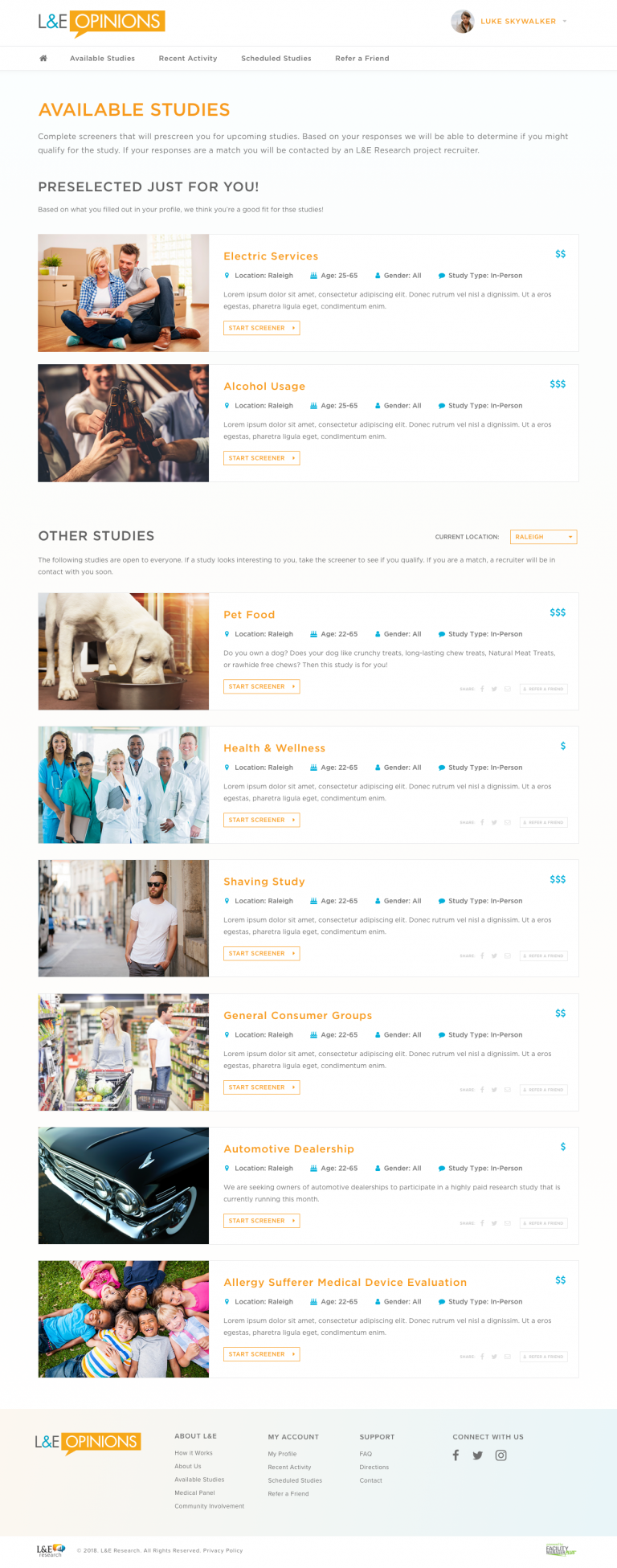
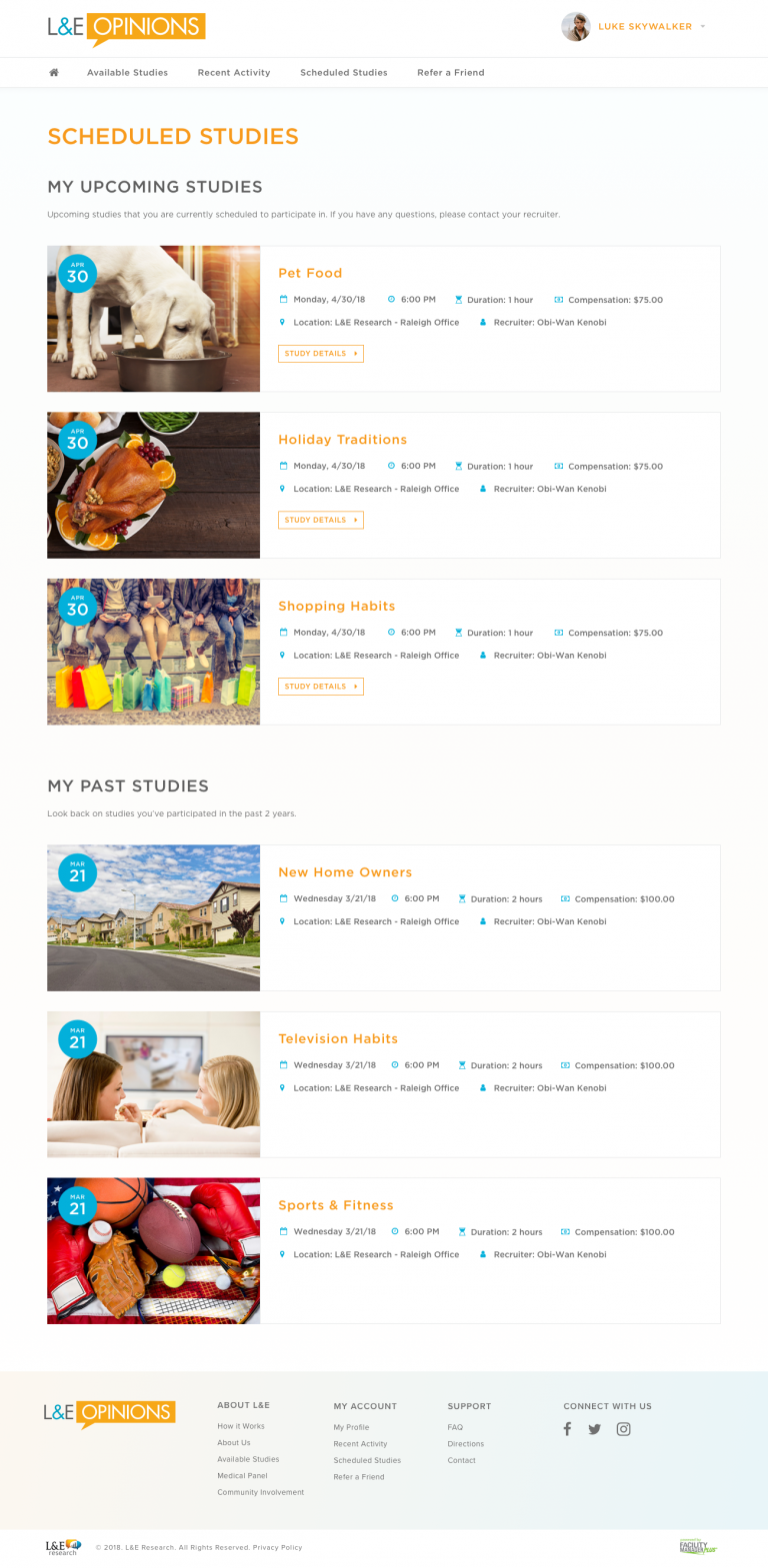
The portal navigation did a poor job of driving users to the pages that L&E wanted them to visit. The portal had two pages where users could sign up for studies—”My Surveys” and “Current Studies”. “My Surveys” contained invitations to preselected studies for the member based on the information in their profiles. “Current Studies” contained other study opportunities that the member could sign up for. However, these study opportunities were less likely to match the member’s qualifications.
L&E wanted to direct users to the “My Surveys” page. However through testing, we discovered that majority of the current users did not know what the “Surveys” page was since they were more familiar with the term “study”. To fix this, I standardized the wording used in the portal and combined the “My Surveys” and “Current Studies” pages into the “Available Studies” page.
Cluttered Home Page
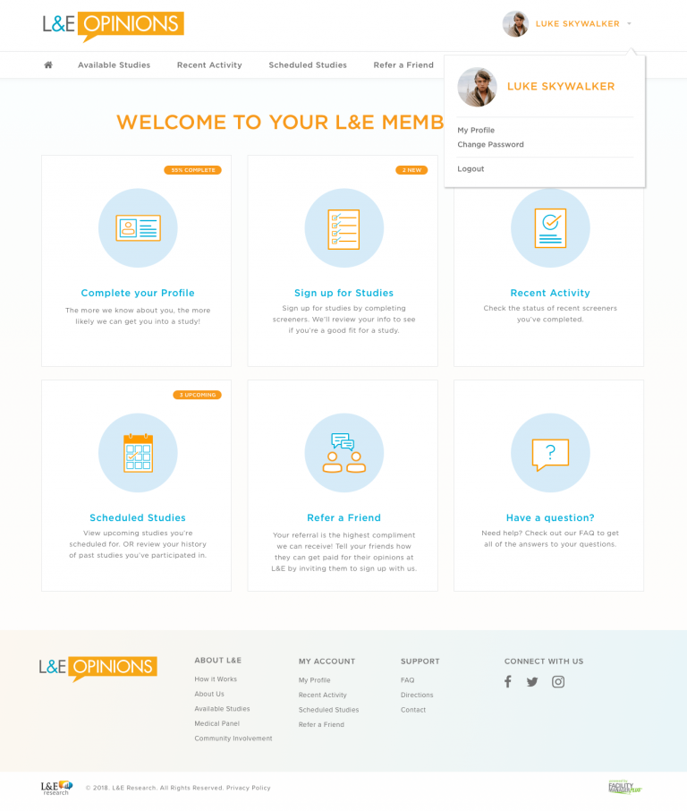
The portal’s home page was cluttered with outdated and irrelevant information. Important information like how to refer a friend to join L&E’s Member Portal got lost in the volume of information on the page.
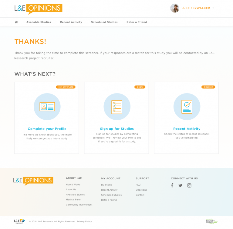
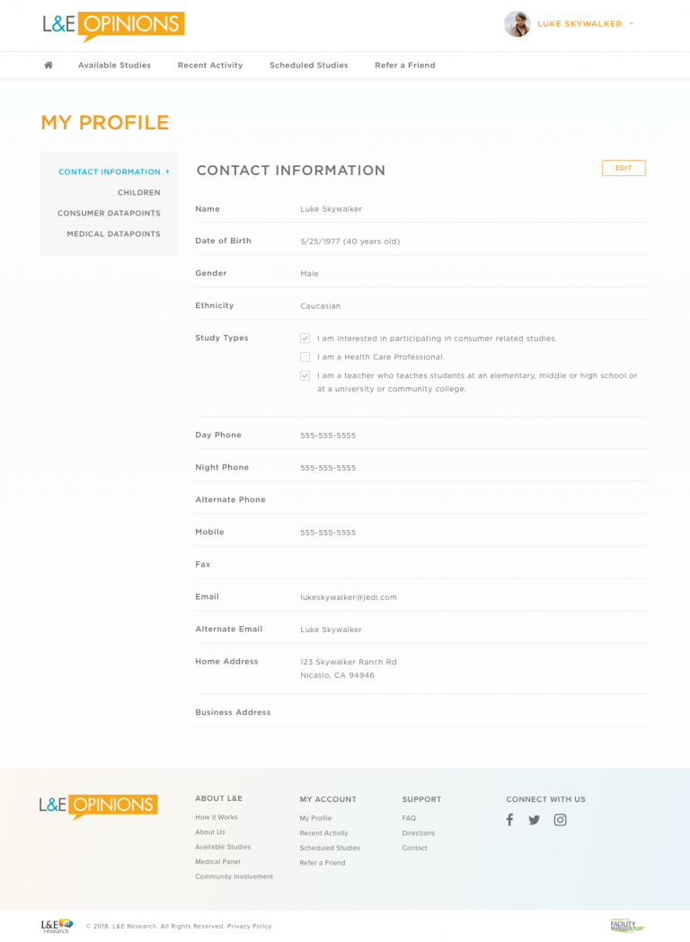
I redesigned the home page into a dashboard view to showcase the six main areas (Complete your Profile, Sign up for Studies, Recent Activity, Scheduled Studies, Refer a Friend, and FAQ) of the Member Portal.
Poor Communication About Study Qualification
Users fill out a questionnaire to determine if they qualify for a study. However, users were only notified if they were accepted into a study. Most users who fill out the questionnaire do not get selected for the study. These users were left in limbo since they received no notification about the questionnaire they filled out.
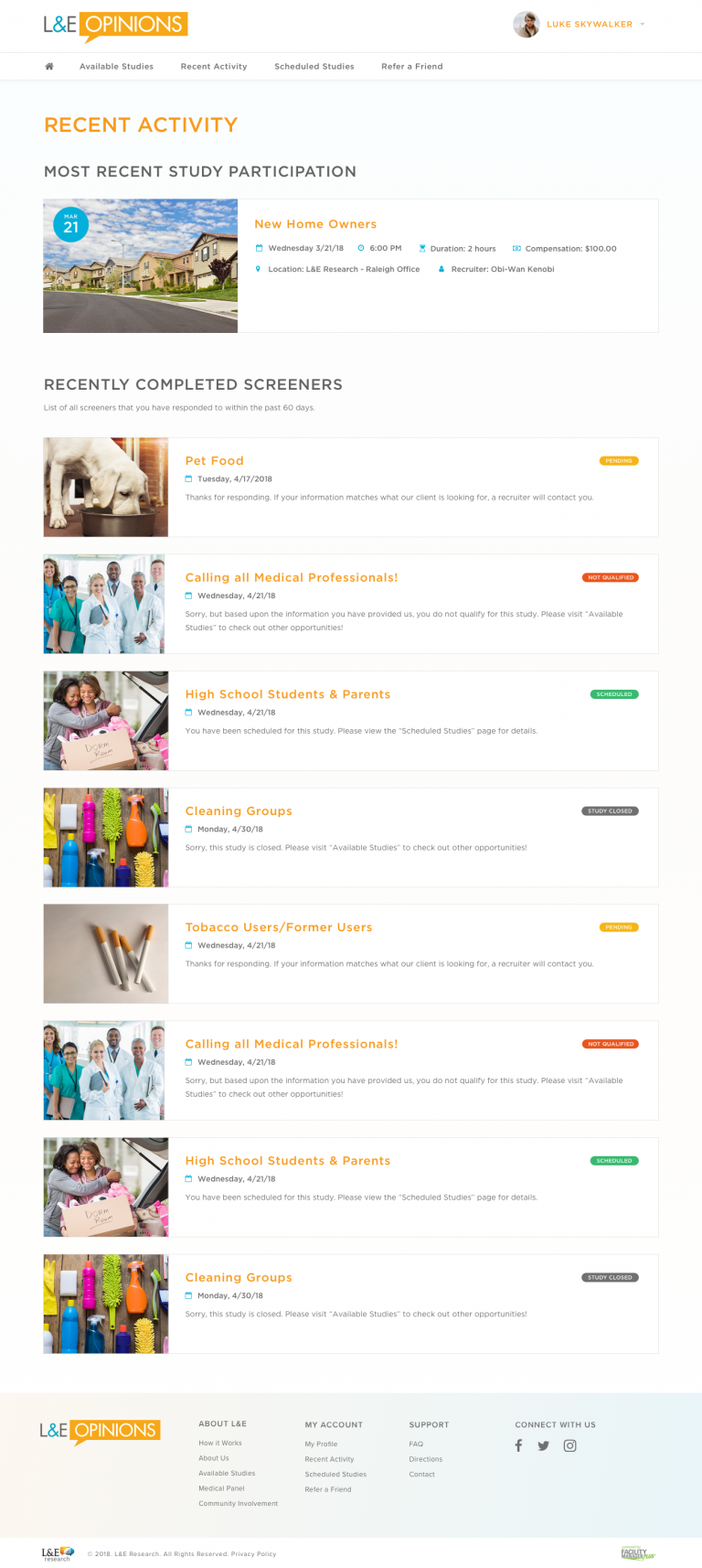
To address this, I created four color-coded statuses (Pending, Not Qualified, Qualified, and Study Closed) to indicate on each questionnaire on the “Recent Activity” page, so users could have more visibility about their qualifications.

Manual Process for Collecting Responses
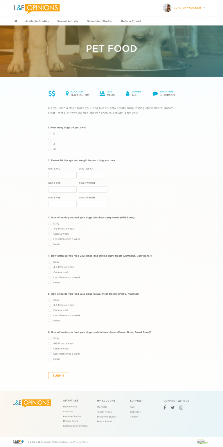
Users need to fill out questionnaires to see if they’re qualified for a study before they’re accepted into a focus group. Instead of filling out a standard questionnaire, users were asked to respond to multiple questions in a single text field. Then a L&E recruiter would read through the responses and select users that were qualified for the study. This process was time consuming for both the user and the client.
To make the process more efficient, I redesigned the questions into a multiple choice structure. Instead of typing out a response, users can now simply select the response that best applies to them. By using multiple choice questions, we were able to automate the selection process, removing the need for a recruiter to review the results. Due to this streamlining, users are also able to receive notifications about study qualification in a more timely manner.
Portal Design

HTML Email Templates
L&E’s Member Portal has 28 system emails that automatically trigger when certain criteria are met. Users receive emails when they reset their passwords, are selected for a study, when their payout for participating in a study has been processed, and when a new questionnaire becomes available in the Portal.
The majority of members access the Portal only when they receive email notifications about upcoming studies.
During testing, our team discovered that the majority of members access the Portal only when they receive email notifications about upcoming studies. The majority of users also access their email and the Portal through their mobile phone. Because of the importance of this traffic channel, I redesigned the system emails to match the skin of the redesigned Portal. I also re-coded the HTML emails in order to optimize the templates for mobile devices.


